Feb 10th & 12, 2021
(ADA) Improve Tour Builder Color Contrast
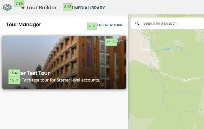
Light colors and thin fonts are standard in modern web design, but they’re not the most accessible design choice. For users with low vision, these colors and fonts make webpages much more difficult to navigate and understand. Tour Builder has been updated to adhere to higher contrast standards that allow more users to use our platform: buttons in the top bar, counters in the Tour Manager, and help text are all now darker to increase color contrast.
Color contrast has a standardized test that allows us to quickly see which elements of Tour Builder aren’t passing.
Other Updates
Various Bug Fixes
____________________________________